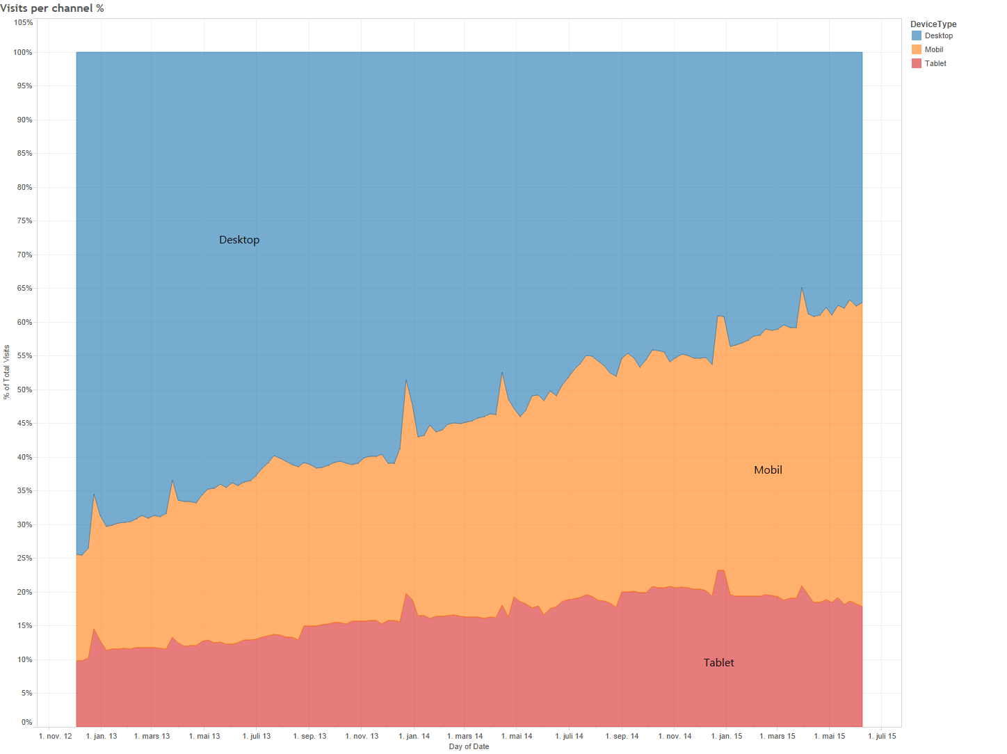
In July 2013 more than 40% of the visits to FINN.no were from a tablet or a phone. Nearly one year later, in April 2014 - the share was 48%.
What do you think has happened the last year?
In April, Google rolled out their “mobile-friendly update”, which boosts the ranking of sites that are mobile friendly in the Google search. We’re clearly not the only one seeing the increased market share of mobile devices.
How many visitors use a desktop or laptop?
Our first graph shows the share of our users using a mobile phone, tablet or a desktop computer to access FINN.no, regardless of whether they use the traditional somewhat-responsive-desktop-web (www.finn.no), our responsive mobile web (m.finn.no) or an Android or iPhone app. 62% of our visits are now from a smartphone or a tablet. The traditional desktop/laptop has a market share of 38%.
Which FINN.no application do people use?
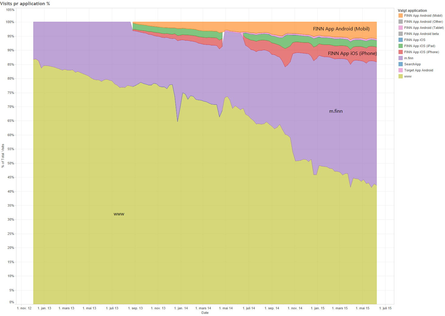
We have three major versions of FINN.no - the desktop, the responsive m.finn.no, and native apps. Our reponsive site is now the biggest! 14% of our visits are from our native apps, 42% from www.finn.no, and 44% from our responsive m.finn.no.
Browsers
First of all, let’s take a look at the numbers of the browser vendors. The ranking is clear, Apple is the biggest, ahead of Google, Microsoft and Mozilla - and Opera is still in the top 5, representing more than an amazing 0.2% of our visits.
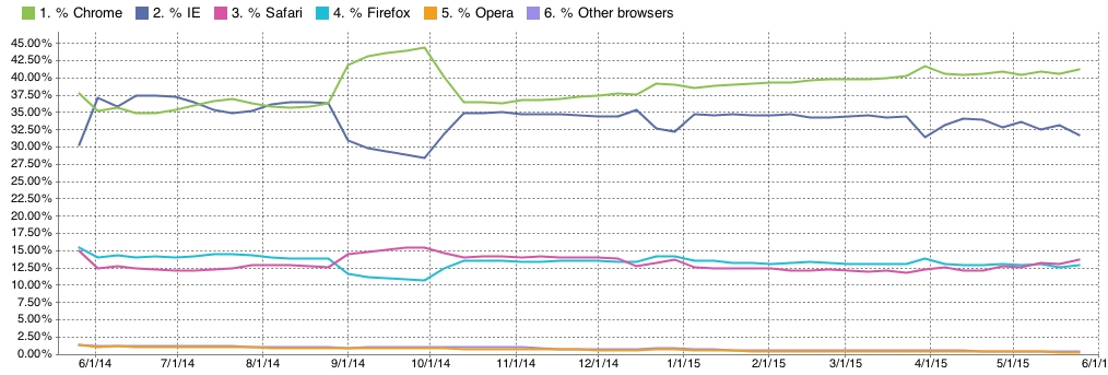
Do you remember the “browser wars”? When IE 8.0 ruled the web? In case you wondered which browser is the biggest on the “desktop” here’s the trend:
The complete browser statistics, across all applications are as follows:
It seems like a good idea to make sure your website works well with Safari!
In case you still have Internet Explorer 9 as your favourite, it’s still making it to the top 15, with a total share of 1.2% of our traffic, marginally behind Internet Explorer 10 with 1.4%. In 2015, poor IE8 is down to 0.3%.
Thanks to Tobias Flatin, Chris Searle, Gregers G Rygg, Trond Hjorteland, and others for feedback.
Tags: browser statistics


