When developing a website which affects the life of almost every person in Norway, accessibility should be a main priority. Norwegians who are not able to use FINN.no are unable to find a home without assistance. Accessibility considerations are too often an afterthought, and this can have profound effects.
In the Spring of 2014, a small group of employees got together to find out how to make our colleagues care more about accessibility. After two years, the measures we think work best are workshops, user tests, and automatic validation.
Workshops

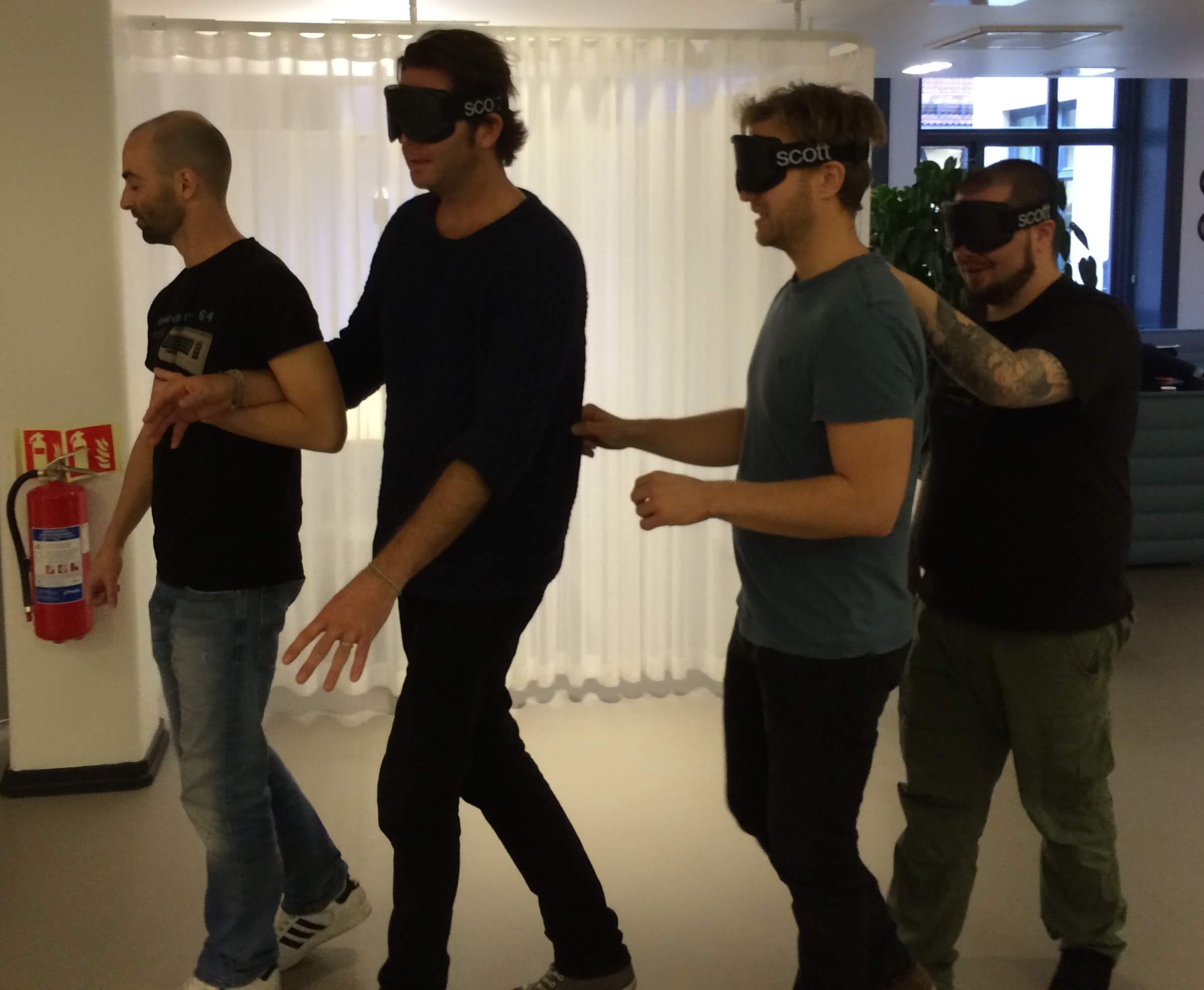
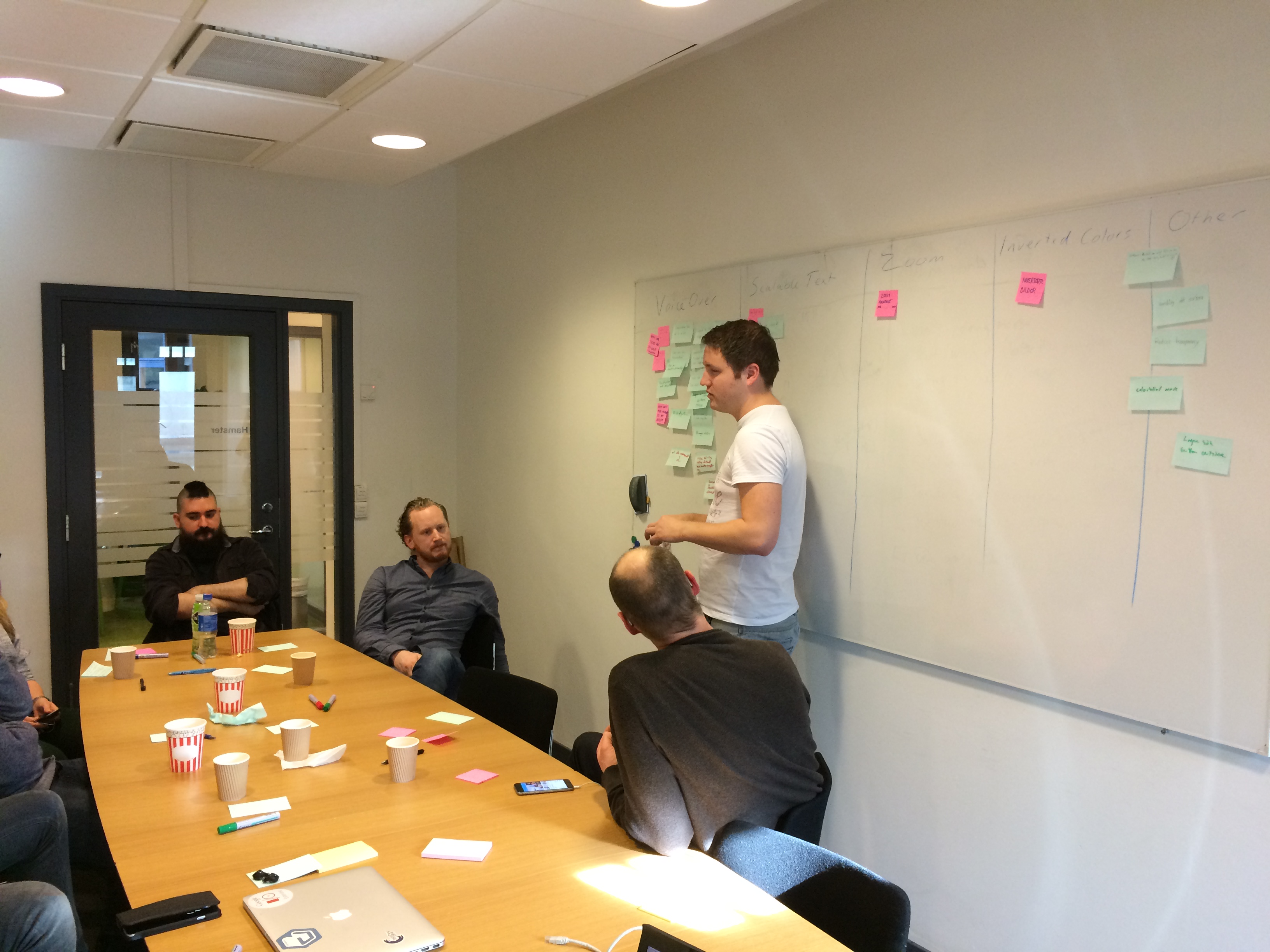
At our workshops we demonstrate how FINN.no works for people with disabilities before we let the team members test it the same way themselves. People find this a lot more inspiring than memorising WCAG 2.0 recommendations and running automatic validations locally.
How to test
Scaling Pages
The simplest thing to test for is page scalability, both for fonts and for the entire page. Most desktop browsers make it possible to scale both fonts and page no matter how poorly coded the pages are, but on mobile phones it’s still quite common to lock page size to screen size. It must be possible to pinch zoom every page on mobile phones.
The Straw Test
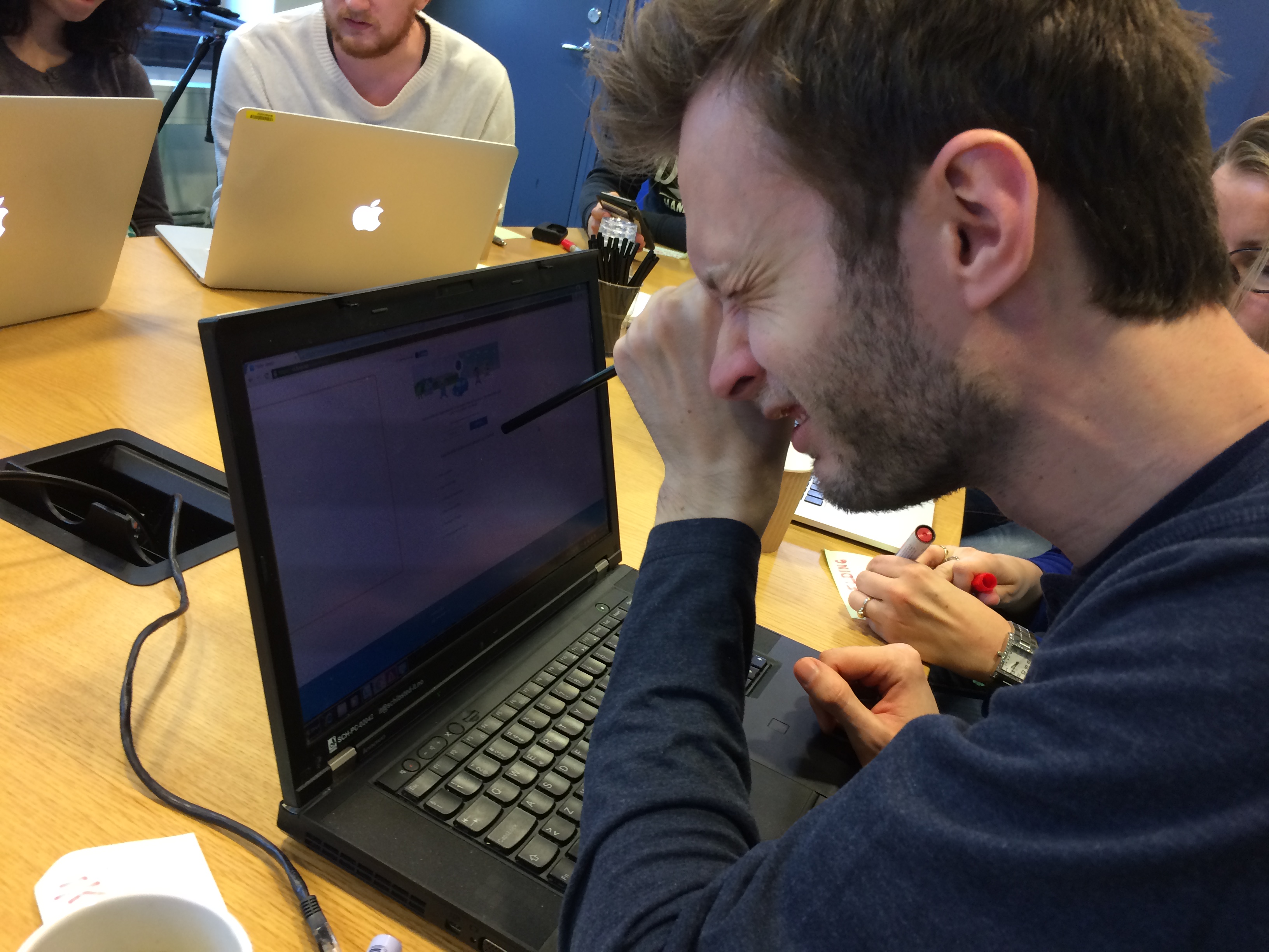
Another simple method is to pretend that you are looking at the page through a straw. This simulates how the page will appear for partially sighted people who either have a limited field of vision or need to magnify the page to read it. This reveals relevant elements spaced too far apart in a way that will make it difficult to navigate the page.
Keyboard Navigation
Most pages are designed and coded with mouse click and touch screens in mind, and we easily forget about people with broken arms, motor disabilities, or other reasons for not being able to use a mouse. By navigating the page with only a keyboard, we test that focus on links and buttons appears in a logical order.
High Contrast
Many partially sighted people are sensitive to bright light or struggle to see the contrasts on a page. They often invert the colors on the screen or switch to high contrast mode. Check that your pages are still readable in these modes. If you are using sprites or in other ways put relevant information in a background image, you may notice that this disappears on computers running Windows.
Screen Reader
Blind people depend on a screen reader to use a computer. Most cell phones have a screen reader built in by default. On Apple devices this is called VoiceOver and on Android it’s called TalkBack. You can turn this on in the accessibility settings. It takes some practice to use a screen reader, but when you handle it, you are likely to uncover a huge number of accessibility flaws.

User Tests
By testing our site during the workshops, we uncover the most obvious bugs. However, we cannot know how it actually feels for users with disabilities to use our site. That’s why we run user tests with blind and partially sighted users. We have people who run user tests at FINN, but because we don’t know what it’s like to be blind, we don’t always understand why they react as they do. Therefore, we need some external expertise to assist us. We are cooperating with Blindeforbundet (The National Association of Blind and Partially sighted, NABP) who run these tests for us.
Designers, developers, and product managers watch the tests, which are also videotaped for further analysis. After the tests, NABP hands over the videotapes with a commented report and recommended improvements.
Automatic Validation
Our next step is to include WCAG validation as a part of our automated tests. There are several tools offering this, including Pa11y and Tenon.io. We are likely to use Pa11y in our first effort, because it’s free.
Automatic validation gives an overview over detectable WCAG violations, and may work as a KPI for accessibility awareness or even break builds with new violations. If all developers and designers pay attention to this, we hopefully will stop deploying code with new WCAG violations.
Read more about Pa11y and Tenon.io.
Is It Working?
Accessibility used to be looked on as some kind of geeky pedantry for something that otherwise works fine. This attitude has changed over the past few years, and people take complaints about accessibility more seriously. In an internal speech I once mentioned that many of our pages weren’t scaleable on mobile. The next day, three teams had fixed that. A blind user complained that our iPhone app didn’t work with VoiceOver. This was fixed before the next release (several hours later). Another user complained that our banner ads caused epileptic seizure. This resulted in a huge debate on our forums, but sadly we still haven’t found a perfect way to use banners in a way that make both users and advertisers happy.

Whatever we do, the most effective way to get our accessibility flaws fixed is feedback from the users. We are not perfect yet, and we don’t always find accessible solutions that make everyone satisfied. Knowing that a user is unable to use FINN.no is far more convincing to our managers than being told that they have a WCAG violation. So please, if you have disabilities that make FINN.no hard to use, contact our service desk. It takes only one complaint to put your problem on our agenda.
Tags: accessibility