In the post Putting a face on quality we talked about how we wanted to bring our end users closer to our developers by visualizing tweets about our service. This was only one of many tasks we performed in order to get a better feel on how our work effects our users. In this post we’ll show you what we did in order to put numbers on end user quality by working with out customer service team.
Up until now our customer service team had a hard time visualizing the effect our code had on end users. They where publishing numbers on number of incoming requests, but these numbers where on a weekly basis at best.
Research in the wild
Therefor we set out with the goal of making all support requests visible in real time for the entire organization. Out hypothesis was that this would provide everyone on our teams from developers, product owners and sales staff with a clear view on what kind of quality they deliver.
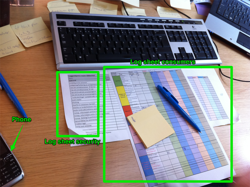
In order to figure out what our application should look like we set out to see what the reality was and sat with our customer service team to see how they worked. But they had no system in place for logging requests and what area of our service it was about. All we had was the statistics from our support ticket system and call center. These systems did not provide enough detailed information, therefor our Lean task force team encouraged them to start logging requests on paper then put it all into a set of Excel spread sheets. Needless to say this required quite a bit of effort from the people one the customer service team and it was not a solution for the long term.
When deciding how to approach creating a application for logging requests we looked at how the analog logging process was performed. Realizing that a request could be for more than one problem area and effect multiple teams we realized that the paper layout was in fact ideal. We created a quick prototype in HTML and had the users test it. This prototype had no persistence and did only show how the process of logging a request would look and feel. We didn’t create anything else as this would’ve been waste if we where not to proceed with the application. By not building anything besides what was absolutely necessary we where able do deliver quickly (3-4 days) and we had no inventory which would become waste if our prototype didn’t match what our end users required. For simultaneous testing of the prototype we compared against an off the shelf product which used a wizard style approach to logging requests. Both prototypes was tested by the customer service team and the results where clear: the flexibility of the paper layout performed way better as it was quick and non-intrusive.
The penalty of success
With the success of the prototype we were now expected to deliver a solution which actually persisted the data and had a set of reports which would help visualize the requests coming in from our customers.
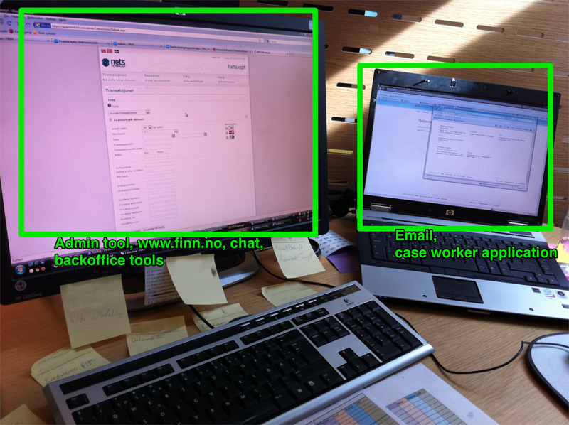
The application has to be delivered to the team actually responsible for all our back office applications and so this put some requirements on which technologies to use. We develop most of our services with Java so this would be the choice for the back end. On our mobile web solution m.finn.no we use RestEasy to provide a REST interface for our one-page JavaScript front end, therefor this would be the choice for our application as well. Along with Spring/Spring JDBC and a MySQL database this was our back end. We specifically opted for conservative technology choices as we wanted to hand over to be as smooth as possible. On the client side we opted to do a one page application written in JavaScript with the help of jQuery and a custom made publish-subscribe library along with Mustache for templating in our JS code.
Your friendly neighborhood log application
The only requirement from the customer was that it had to be effortless to log entries into our system. “There should be no reason not to log entries into the system”. We adopted what we call a “angstfri brukeropplevelse”, which translates into something like an anguish-free user experience. Everything else was pretty much up to us to decide. The grid based layout inherited from the analog log was a success. Therefor all we added was keyboard navigation and a cross hair behavior which provided the user with an easier way of seeing which column they where in to help avoid invalid log entries. We specifically avoided any kind of validation or other kinds of business rules as this would only make the threshold for logging a bit higher and this was not acceptable.
Having added a back-end and enhanced the user experience we did an initial test as soon as possible to get feedback on reports. A couple of tries later we where in production.
Quality ~= Visibility + Skills
Why did our architects set out to create an application for our customer service team you may ask? We focus upon enhancing the quality of what we deliver to our users and customers. Making sure everyone in our organization knows exactly how our work affect our users is one of the most important ways to make sure quality is always at the forefront in everything we do. This is why we used a couple of weeks to create this application. To quote some of the engineers at Facebook: “we want to bring your mother close to our developers”. We want everyone to feel that their mom is their users and who wants their mom to experience bugs or errors?
 In order to make things visible we needed to iterate over our previous solution which visualized tweets about us on Twitter. We did a redesign and integrated some key figures into the application and the end result became really awesome, hence the name Awesome Board II.
There is still one more piece of the plan for visualizing quality and it will be discussed in a later post. However you can view it on some of our pages already.
In order to make things visible we needed to iterate over our previous solution which visualized tweets about us on Twitter. We did a redesign and integrated some key figures into the application and the end result became really awesome, hence the name Awesome Board II.
There is still one more piece of the plan for visualizing quality and it will be discussed in a later post. However you can view it on some of our pages already.