FINN.no has recently released new pages for real estate ads. Larger images, broker business cards and tabs for additional information are some of the new features on this page. A long process of in-depth users interviews, workshops with real estate brokers, user testing of design sketches and several sprints of development, we are proud to finally see the new pages on www.finn.no.
Pick a nice home from this list to view the ads Cut the general crap - show me the business cards!
What’s in it for the user?
 Larger images and the possibility to navigate through images without leaving the page were the first thing that was noticed, and liked, during our user testing sessions. For a full size view of 900 pixel images we have still kept a link to our old image viewing page. However, after release we have got feedback from many users who failed to find this link and complain that images are smaller. There is still work to be done to improve this.
The information about the home is divided into primary and secondary information. The prime information, like price, area, address and viewings, is put at the top of the page, so the user won’t need to scroll to find it. More detailed information, like facilities, plot size and descriptions is located below the prime information and the image viewing module.
Secondary information is integrated by tabs. Fakta (facts) is the default tab, containing information about the estate from the broker. Prisstatistikk (price statistics) is highlights from Eiendomspulsen, which displays information like average price per square meter in the area and prices for previous sales of the actual estate. Neighborhood profile is an additional service brokers may add to their prospects with information about nearby services, schools and demographics.
What’s in it for the broker?
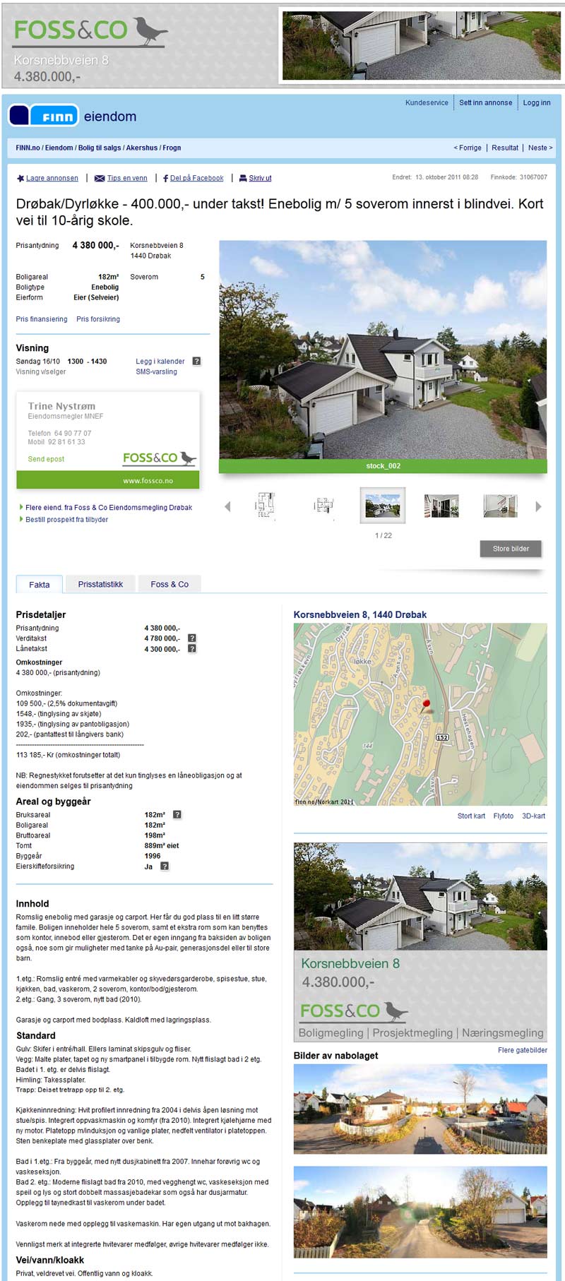
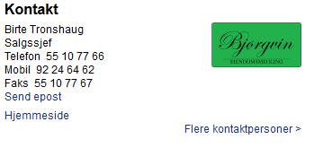
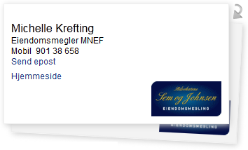
Realestate brokers have requested more options for building brand awareness in the prospect. To meet this request our designers suggested the brokers may design their own business cards for their contact information and to use their profile colors at some other elements on the page. They may also offer their services after the last image in the image gallery and in a tab next to Price statistics and Neighborhood profile. Interviews with users indicate that information from the broker won’t be regarded as ordinary banner ads as long as they provide information that is relevant for users who are in the process of changing their home. Krogsveen (a major realestate agent in Norway) has taken good advantage of this banner position by listing properties they have recently sold in the same area.
How to make the business cards
There are three ways to display the broker’s contact information. Basic prospects have a simple listing of name, position, phone and fax numbers along with a company logo. Brokers who are using expanded prospects, which are prospects with the broker’s own set of banners, have their contact information styled as a business card. Brokers may customize these cards with their own css, background image and a picture of the broker.
Some prospects have two brokers listed, but to save space only one broker is visible at the time. In expanded prospects business cards will swap when the user click a looping arrow or the card in the back. In basic prospects the name of the other broker slide in when clicking the “more contact persons” link. Jquery animation is used to swap the cards and CSS transitions is used for the sliding of contacts in basic prospects.
The markup is the same for all levels of contact information, supporting the hcard microformat, while there are three layers of css. Styling of the contact information on basic prospects is in the main css file. Default business cards are styled by using a seperate css file which adds the business card look and overrides the default css where necessary. Customized business cards are styled by a third layer of css, which overrides the classes from the default card to add a background image and their company’s colors and fonts.
By the time of release we had 13 different customized business cards on our prospects.
Contact information for a basic prospect
HTML code for a business card looks like this:
    <address id="flip_0" class="vcard flip  backgroundimage">
      <a href="(url)" class="orglogo" target="_blank"><img src="(url)" alt="Utleiemegleren Sinsen" border="0" class="logo"></a>
      <span class="fn n brokerName">Karianne Johannessen</span>
      <span class="ul">
        <span class="li title brokerTitle">Supermegler</span>
        <span class="li brokerPhoneHolder">
          <dl class="tel brokerPhone">
            <dt class="type hideText">Work</dt>
            <dt class="displayText">Telefon</dt>
            <dd class="value">22 79 66 26</dd>
          </dl>
        </span>
        <span class="li brokerMobilHolder">
          <dl class="tel brokerMobil">
            <dt class="type hideText">Cell</dt>
            <dt class="displayText">Mobil</dt>
            <dd class="value">48133956</dd>
          </dl>
        </span>
        <span class="li brokerFaxHolder">
          <dl class="tel brokerFax">
            <dt class="type hideText">Fax</dt>
            <dt class="type">Faks</dt>
            <dd class="value">22796601</dd>
          </dl>
        </span>
        <span class="li brokerEmail">
          <a data-click-mt="mailto" href="(url)" class="click-track">Send epost</a>
        </span>
      </span>
      <div class="clearall"></div>
    </address>
This is the basic css for contact information:
    .contact {overflow: hidden; width: 330px;}
    .contact .cardWrapper {position: relative; width: 700px;}
    .contact address {-moz-transition: left 0.7s ease-in-out;-webkit-transition: left 0.7s ease-in-out; -o-transition: left 0.7s ease-in-out; -ms-transition: left 0.7s ease-in-out; transition: left 0.7s ease-in-out;
        background-color:#FFFFFF; display:block; float:left; font-style:normal; position:relative; width:330px;}
    .contact .hideText {display: none;}
    .contact .orglogo {float: right;}
    .contact .brokerName {display:block; font-size:12px; font-weight:normal; margin:0;}
    .contact .li {clear: left; display: block; margin: 0; padding: 0;}
    .contact dt {float: left; padding-right: 0.5em;}
    .contact dd {float: left;}
    .contact .moreContacts {float:left; width:330px; text-align:right; margin-bottom:20px; }
    .contact address {left:0;}
    .contact address.backCard {position:relative; left:360px;}
    .contact address +  address {left:-330px;}
    .contact address + address.backCard {left:30px}
Default styling of a business card
This is the second layer of css which forms a basic business card:
    #flip_0{z-index:1; top:0; left:0;}
    #flip_1{z-index:0; top:20px; left:15px;}
    .contact .flip.backCard {cursor:pointer; background:#f3f3f3; display:block; transform: rotate(3deg);-o-transform: rotate(3deg);
        -ms-transform: rotate(3deg); -moz-transform: rotate(3deg); -webkit-transform: rotate(3deg);}
    .contact .flip.backCard:hover {background:#ffffff;}
    .contact .cardWrapper {position:relative; min-height:195px; width:auto;}
    .contact .spacer {height:25px; display:block; clear:both;}
    .contact .flip{position:absolute; background-color:white;}
    .contact address {box-shadow: 2px 2px 8px 0 #cccccc; padding:10px; width:300px; height:150px; border: #eeeeee solid 1px; float:none; overflow:hidden;
        -moz-transition: none;-webkit-transition: none;-o-transition: none;transition: none;-ms-transition: none;}
    .contact address .brokerPhoto {float:left; max-height:100px; max-width:75px; margin: 15px 10px 0 0; display:block;}
    .contact .brokerName {font-size:16px; font-weight:normal; margin-top:15px}
    .contact img.brokerPhoto~ul {max-width:190px}
    .contact .orglogo img {position:absolute; bottom:10px; right:10px;max-height:100px; max-width:100px; }
    .contact .moreContacts {display:none;}
    .contact img.moreContacts  {float:right; position:absolute; top:0; right:-12px; display:block; cursor:pointer; width:14px; height:22px}
    .contact .ul {float: left; display:block;}
Customized business card
 This third layer of css forms the broker’s customized business card:
    .contact * {color:#46464a; font-size:11px;}
    .contact .orglogo {display:none;}
    .contact .brokerPhoto {margin:11px 20px 0 11px !important;}
    .contact .brokerName {font-weight:bold; font-family:"Lucida Sans","Lucida Sans Unicode","Lucida Grande",sans-serif; margin:8px 10px 0 0; font-size:12px;}
    .contact .brokerTitle {margin:0 0 5px 0;}
    .contact .brokerPhone dt {font-weight:bold;}
    .contact .brokerMobil dt {font-weight:bold;}
    .contact .brokerFax dt {font-weight:bold;}
    .contact .brokerEmail a {padding-top:5px; display:inline-block;}
    .contact .brokerEmail a, .contact .homePage a {color:#46464a;}
    .contact .homePage {margin-top:0;}
    .contact .backgroundLogoLink {position:absolute; left:0; bottom:0; width:320px; height:25px; display:block;}
Read more about hard boiled business cards and the hcard microformat Dig deeply into hardboiled web design
The feedback
Three weeks after the release we have recieved 1060 feedbacks, 630 positive, 374 negative and 56 indifferent. This is actually better feedback than we are used to after releasing such a radical redesign. Our biggest challenge is to make it easier to view images in full size. For other layout issues it seems like people simply need some time to get used to it. I have seen no complaints from users who dislikes the business cards, which was one of our biggest concerns before the release.
Our analyzing tools tell us that the average viewing time on this page before the release was 33 seconds. After the release of the new design the viewing time has increased to 1 minute and 15 seconds, at the expense of the image viewing page, which page views has dropped rapidly. The number of page views of the ad page has also dropped, probably because of less navigation to and from the image viewing page. However, the number of visits on the ad page seems to be stable.
Tags: Interface development