The starting point
In a galaxy very very close by, there were 5 brave summer interns working for FINN.no. They came from the far north (NTNU) and the far south (UiO) of the cold and rainy plains of Norway. 4 of them were taught in the arts of the computer, and one in the teachings of the design. They had a mission: to improve the current user experience for advertisers on FINN Torget, and to decrease the amount of zero-contact ads. A tough mission, but our heroes have valiantly fought during the summer of 2017 to resolve this quest.
During the first week of the summer internship we (the interns) were introduced to FINN.no, its systems and our coaches for the summer project; Martin, the brilliant programmer and Ingrid, the amazing designer. In order to ensure everyone on the team were on the same page a brainstorming session was held. During this session possible solutions for the summer project were developed, and our mutual ambition for this project was put into words. Our ambition has been to: “Increase the amount of ads receiving feedback/being sold on FINN.no” and “Help advertisers on FINN.no make better ads”.
In the past 2 months two concepts have been realized, with quite surprising results and developments. But you have to read the rest of the document to know exactly what surprising developments took place :) Sorry, that’s just life bro/hon!
Project 1: Tilbakemelding (Feedback)
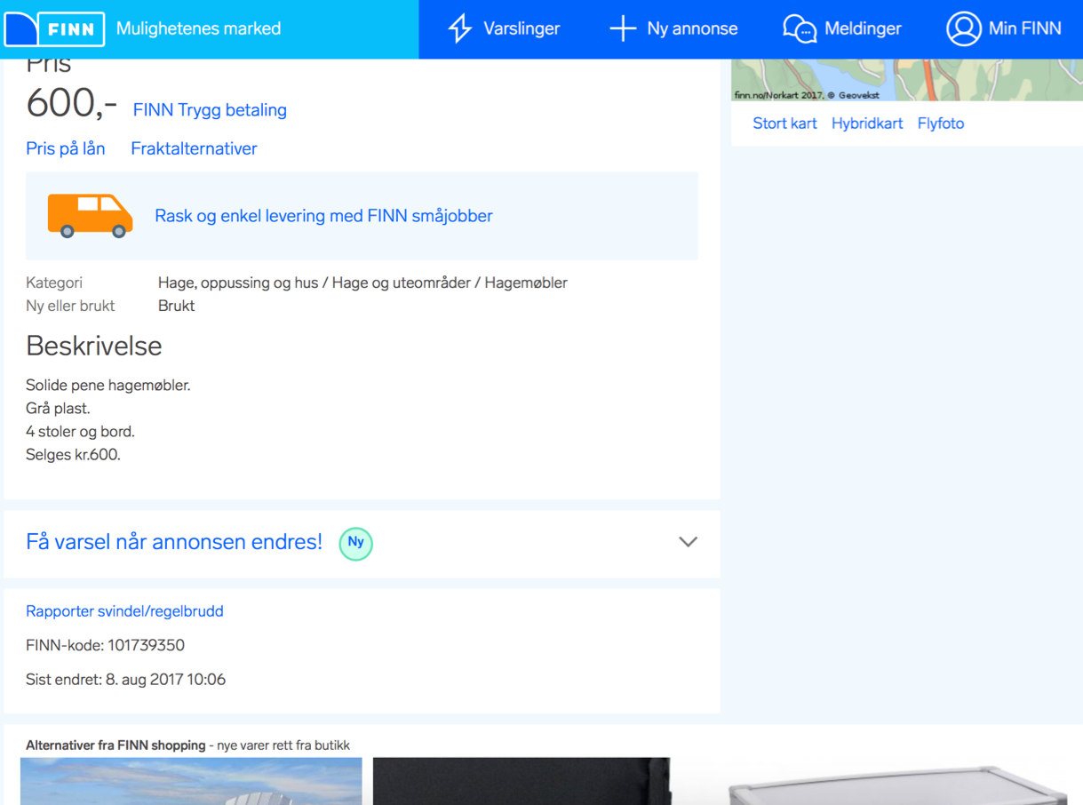
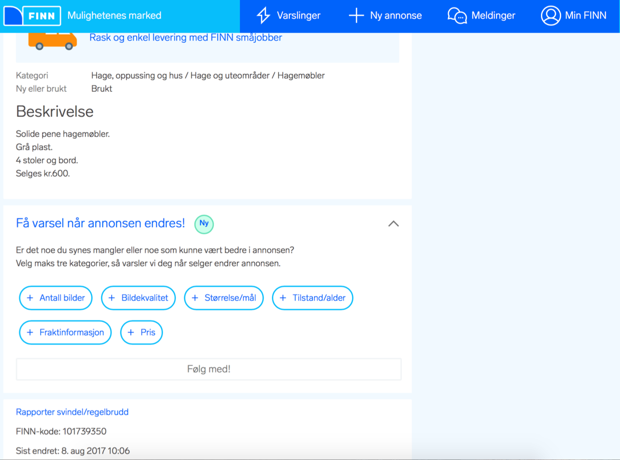
Have you ever created an ad and received no feedback, no likes and no messages? This is the reality of approximately 50 % of all ads published on FINN Torget in Norway. Imagine if there was a way for advertisers to know exactly how they could improve their ads, what would it look like? “Tilbakemelding” is one possibility. Tilbakemelding is a button located at the front page of an ad for all potential buyers to see and use. If a user does not like an ad, and feels that sending a message is too much of a hassle, they can push this button. By doing so, a set of possible improvements to the ad will be revealed, and can easily be selected. Compared to sending a message this is less time consuming and the feedback can be used to create statistics to help the advertiser improve their ads. In this project, the focus was first and foremost to create the button and observe how users of FINN.no would experience the new functionality.
After implementing the solution and launching it on FINN.no website, it was determined the new functionality was used by barely any users. Some tears were shed, and a new direction was chosen. It was decided to rename the button, and make it into a notification button. By using the new button users can choose specific tags and be notified when this tag has been edited in the ad. It turns out this option was used more, however not enough to deem this a valuable asset to FINN.no’s website.
Technical solution
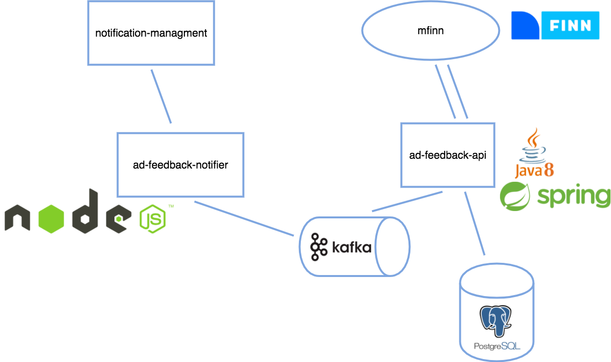
There were several steps to go through before we could launch our solution. We were lucky to get the opportunity to develop it the whole way from backend to frontend. As we have understood, this is a common practice in FINN.no. This so that the developer can feel a greater ownership to his or her code, and can follow it the whole way through the process. Our solution took the form of a separate API running inside kubernetes in FINN.no’s tested and proven microservice architecture. PostgreSQL was chosen as the underlying storage, due to both simplicity and familiarity. Docker and Docker Compose were utilized to ensure that dependencies and environments were identical throughout development, staging, production, and to increase the overall speed of development.
Each tag that’s chosen by a user was stored in the database connected to different types of data like the Id’s of the seller, ad and the person clicking on the tags. We used Java, Spring Boot and IntelliJ IDEA to make our API. To represent our solution we used JavaScript, HTML and CSS. Thankfully FINN.no has its own implementation guide that helps both designers and developers to get an understanding of how different solutions should look like, and much of it has already been implemented so it saves developers a lot of time that they can use on other things more fun than CSS.
Results UX Design
Several prototypes were designed using Sketch and Invision, with people inhouse and on the streets helping us evaluate the design. The tests helped us rename several of the tags, helped us deciding the looks of the button and the tags, and the means by which a user should access them. In addition, more elaborate user tests in the prototyping lab of FINN.no were successfully completed, and valuable insights were obtained. Although the user surveys proved a majority of FINN.no users, both buyers and advertisers, wanted a system to improve ads, the user tests proved contrary. It was revealed buyers were not interested in helping improve ads. If they wanted information about the product, they would message the advertiser directly, thus limiting the competition for the ad and receiving a response quickly. Most users did not notice the button at first glance, partly due to the location, but also because they did not feel a need to use it.
Recommendations
During the first weeks of the project, several surveys regarding aspects of “Tilbakemelding” were given to a set of FINN users. Based on these surveys, we know advertisers want advice in how to improve their ads and buyers on FINN.no are not interested in ads if they are too poorly made. Making users help advertisers by giving feedback has proven to be difficult though. Another way of giving advice to advertisers would be to make an automated system capable of doing so. Using an automated system rather than user feedback would also minimize the possibility of buyers misusing or abusing the feedback module (giving inaccurate/wrong feedback). This system could analyse the amount of pictures, the quality of the pictures, the amount of text, the price etc. in terms of similar ads and compare them to the ad in question. The tags used in “Tilbakemelding” could be used as a starting point, with the most focus on number of pictures and picture quality. According to our results, users would be first and foremost interested in the pictures of the ad. Another recommendation based on our experience is to start user testing early on. By doing so, weaknesses in the prototype can be found before a lot of time is spent programming.
Project 2: Redesign ad dashboard
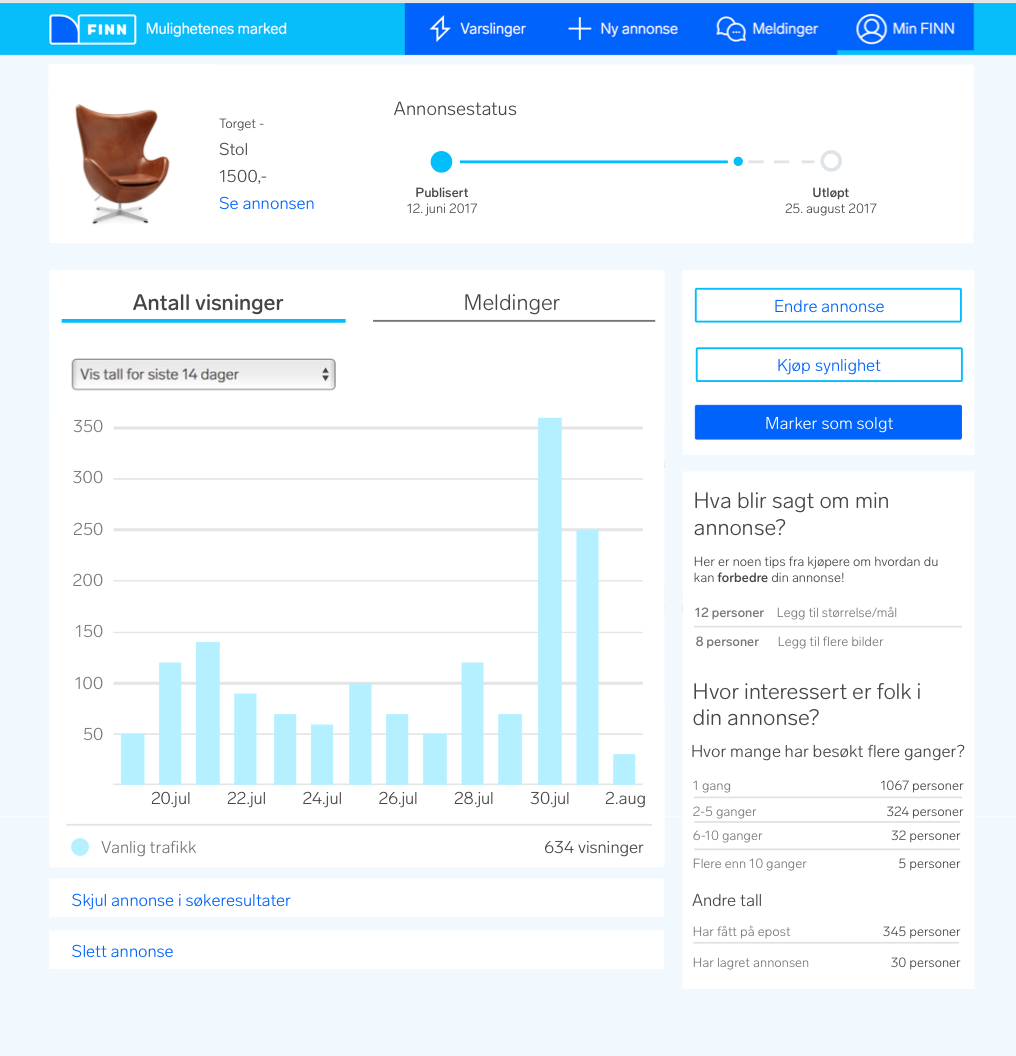
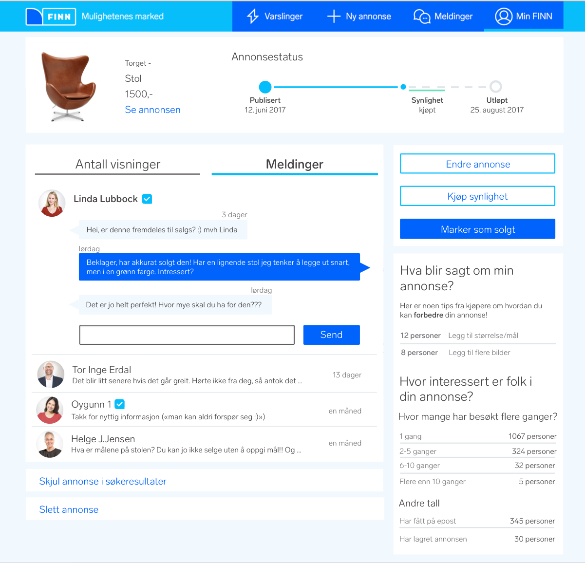
After finishing “Tilbakemelding”, it was decided to do a redesign of the ad dashboard page in order to improve advertisers’ user experience. As can be seen on the picture, several of the buttons have been rearranged, and the statistics have been given more space and importance. The old message system has been upgraded to improve the flow and aesthetics. Tips into how your ad can be improved have been added to motivate and help advertisers make even better ads. Lastly, a timeline showing the past, present and future status of the ad are displayed.
Technical solution
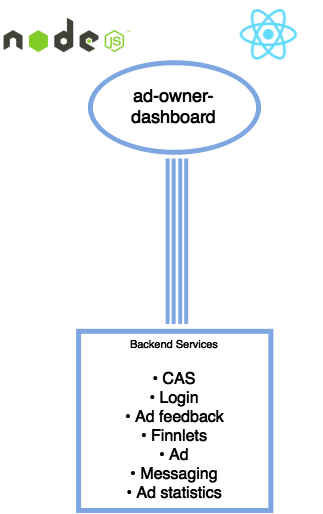
The redesigned ad dashboard page has been created using Node.js and React. By splitting FINN.no into multiple smaller microservices it allows developers to create/modify pages, while still keeping development environments rich and easy to use. We created a Node.js server for handling server rendering and proxying requests to other backend services and a React web application for the frontend. We still utilize existing backend services at FINN, e.g for getting the correct buttons for an ad in a specific state. This allows our newly developed front end to be switched out seamlessly without the user knowing the switched from one application to another. FINN.no has quite a lot of backend services that we can take advantage of to speed up the process. One example of this is the use of Finnlets which creates the identical footer and header while the server is rendering the page to the user.
Results UX design
New prototypes in Sketch and Invision were made. According the user tests in FINN.no’s lab, most people understood the new system, and felt it was fitting nicely into FINN.no current website. Several users did not notice the changes. Almost all users understood the ad timeline, the statistics graph, the new message system and how they could use the given information to improve their ad. One user mentioned he felt compelled to change his ad after inspecting the timeline, and noticing his ad would soon expire. In most cases it took some time before the advice for improving the ad was discovered. However, all users said they wanted to follow the advices after spotting them. In the user test, the most remarks concerned existing buttons and text on the current webpage. These remarks were mostly concerned with the “Skjul annonse i søkeresultater” (Hide ad in search results) button and the “Vanlig trafikk” (regular traffic) statistics, which were both found to be confusing. A majority of the users did not want to purchase “Synlighet” (visibility) because it felt like a waste of money, and told us they had never used this function.
Recommendations
As mentioned, the advice for improving an ad was not noticed by most users, even though they were perceived as helpful and motivating when spotted. By making the advices more noticeable (bigger, more visible colors, more central location) when an ad is either about to expire or has a very low number of views, the people who are in the most need of this information would be more easily exposed to this information. According to our user test results, people who noticed the advices would most likely follow them. Lastly we would recommend “Vanlig trafikk”, “Kjøp synlighet” and “Skjul annonse i søkeresultater” to be renamed. “Vanlig trafikk” could be called “Totalt antall visninger” and “Kjøp synlighet” could be called “Øk synlighet”. A new user test to establish new names should be performed, as well as an user test into making purchasing “Synlighet” more attractive and understandable.
Final thoughts
Working with FINN.no this summer has been very educational and challenging! Although there has been a lot of work, FINN.no made sure we always felt at home in their quarters (it’s actually an old prison for females, who would have known?). We have met and learned from a wide range of professionals this summer, used high-quality software to solve our problems and learned new methods for dealing with challenges. In addition, it turns out working at FINN.no is also amazingly fun! We have been treated to ice cream, pizza and other delicious food (some of us probably have to hit the gym soon), and lots of social activities such as “Fangene på fortet” escape rooms and FINN.no summer party. We, the summer interns, feel very fortunate to have been the chosen ones this year, and we know next year’s summer interns will feel the same!
